This article details the making of the first page of the web comic version of Trials. It includes some of the early sketches and the steps of the page’s coloring process.
First, I knew I wanted to give Trials a higher quality than I do for my usual web comics. To this end, I first attempted painting the first page with digitized watercolor:
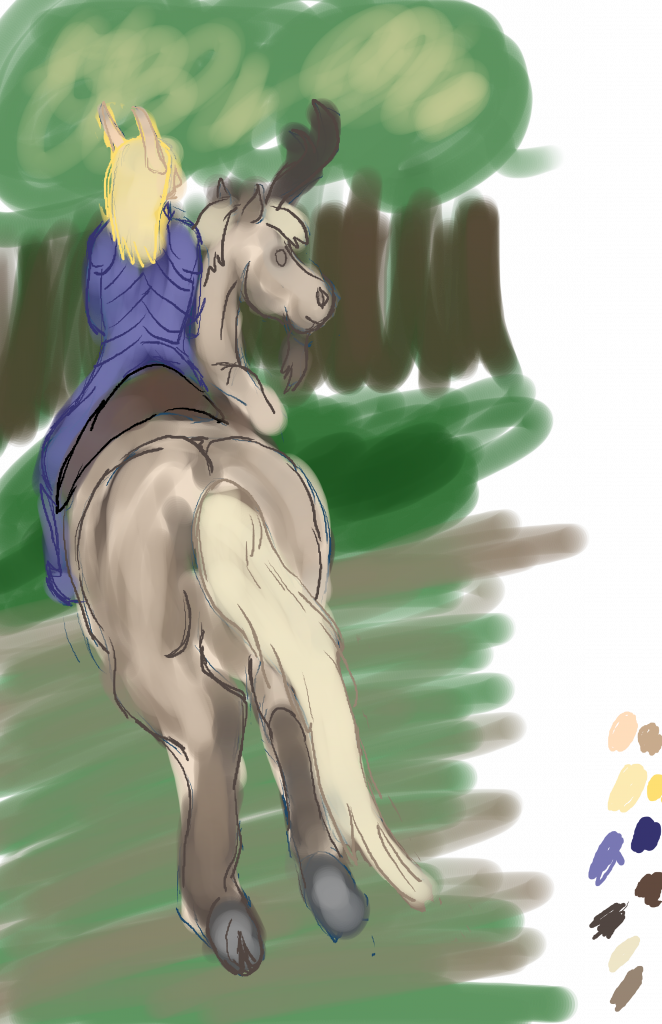
I didn’t like it that much. I found I would struggle in maintaining the same quality and style throughout a whole comic, partially because painting in this fashion is still new to me. I can do line art, fill it in with color, and put in some shading, but doing the whole page up in watercolor and then putting in accent lines after? That would take some doing. I wasn’t ready to bite off that much.
Instead I went back to my usual process, which starts with a line drawing. Something like this:
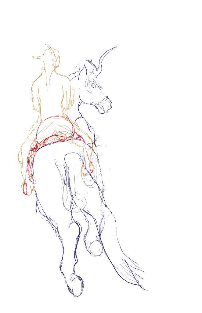
The charger, its saddle, and its rider (Evelos) are done on three different layers. The angle of the horse presented a challenge, and drawing people is a challenge for me any day, so I wanted to be sure I wouldn’t get the sketches of each mixed up. The saddle was sketched in last and also got a different color because it kept blending in with either the charger or Evelos and confusing me.
Next came the basic coloring of the characters. I put all the colors on a separate layer from the line drawings. After I got the colors penciled in, I went back with a black pen to finalize the lines from the sketch. Then I cleaned up the colors, so they stayed within the lines. This is what resulted:
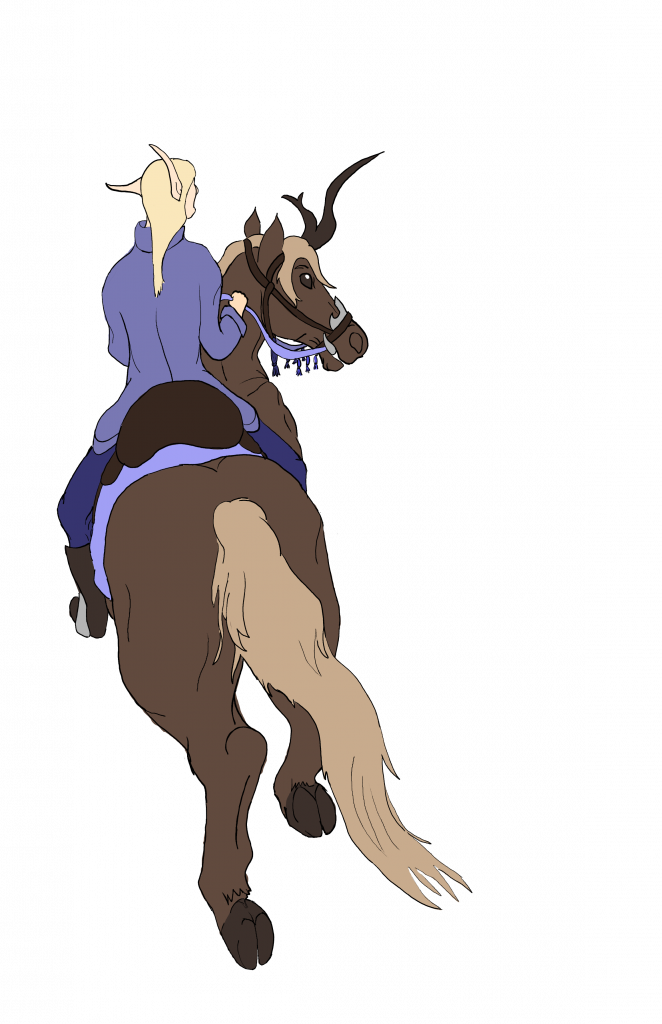
Next comes the background. This is done with a watercolor brush on several layers below the characters.
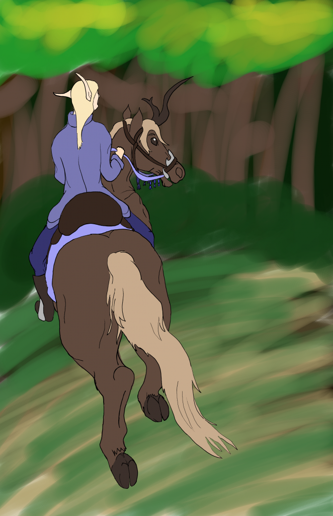
If this were one of my normal web comics, the process would stop here. However, I wanted this series to have a little more quality than my regular comics, and the background was just a little too blurry and nondescript in comparison to the characters. I took a small pencil and sketched in some lines to help bring out the texture of the trees, the shrubs, and the ground cover:
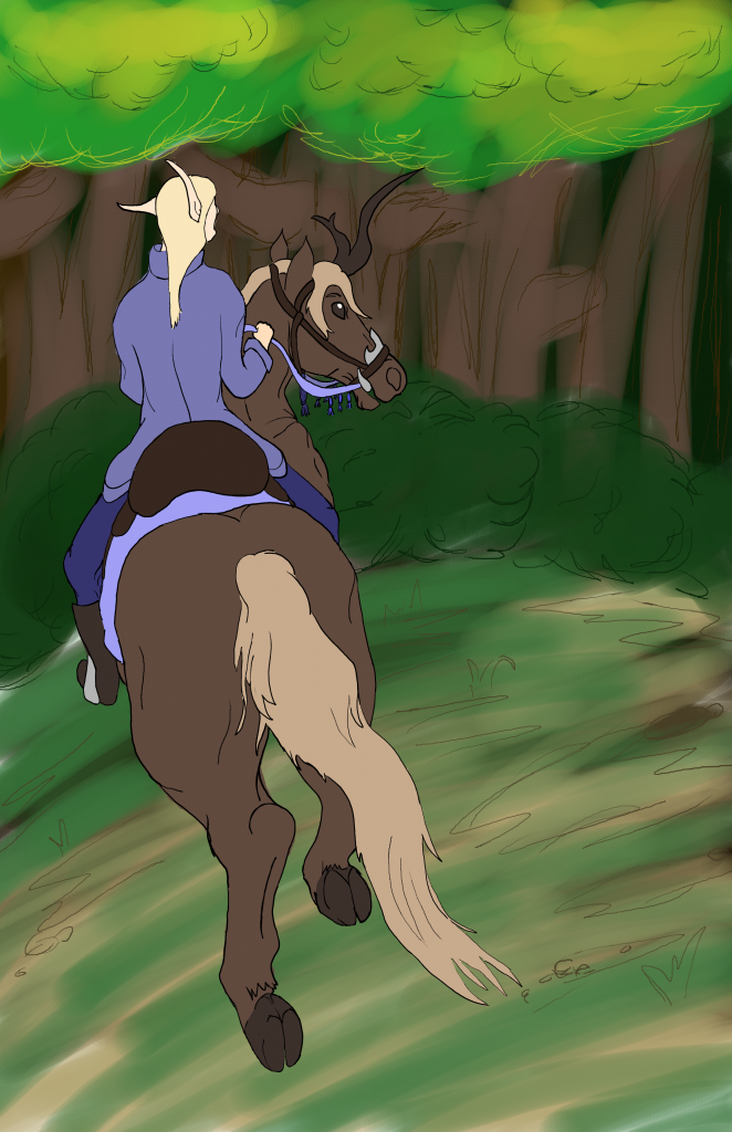
The image still looks rather flat, doesn’t it? Reluctantly, for this again falls into uncharted territory for me and I wasn’t sure if I could keep my quality with it consistent, I went over the characters with another watercolor brush to give them some shading. I also saw the charger’s horn had an unfortunate way of blending into the tree trunks behind it, so I used a separate layer and another watercolor brush to give the characters some bordering. Perhaps in the future I will learn to use background colors that are different enough that the characters pop out more without this hack, but in the meantime, I find it works quite well:
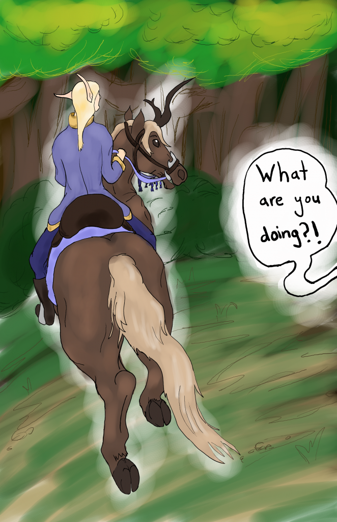
Finally came the speech bubble. This was done with yet more layers to bleach out the white background of the speech bubble and more watercolor brushes to give it a border.
And then I said, no! I do not like watercolor shading. I also do not like the elfling’s face. So I spent a little more time fixing these up. Here’s an intermediary step with the shading completely removed and Evelos’ face redone:

While nice and clean, it still needed shading. This time I tried flat shading, which is more in line with the cartoon-style of the characters. I believed this would be easier to replicate and keep consistent throughout an entire comic series. I am keeping it simple: for every color, there is a lighter hue and a darker hue that goes along with it. In some cases (such as Evelos’ coat) there is only the darker hue.
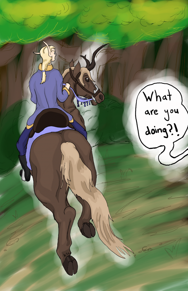
And there you have it. Evelos riding his charger, Fleet, while his mother is yelling at him from another page.
A Note on Story-Boarding
I had known the first page would be a picture of Evelos riding his charger since forever, as this was the picture I had in my head while writing the first scene in the text version of Trials. However, Mirium’s shout about outside rein versus inside leg was too long, and what’s more, too technical to be feasible for a web comic. A short story allows me to get into the details of world and the logic behind the character’s actions and even teach the reader a little about how horse riding works in the real world. In contrast, a comic is quick and dirty, giving general impressions to tell a story.
“Use your outside leg and inside rein! Outside leg! What are you doing?”
The charger and its adolescent rider cantered around the edge of the forest clearing. The rider’s face was a mask of intense concentration and frustration; in contrast, the charger almost looked bored. One was thrown up onto the neck of the other as the latter planted its feet and came to a sudden stop up front of a bale of hay.
“You need to straighten him out if you expect to take a jump at that angle!” Mirium shouted as Evelos stared into the eye of the charger. The charger bobbed its head at him, almost coyly, and picked its way over the bale of hay with delicate steps as Evelos pushed himself straight.
an excerpt from Trials, Part One
For the purposes of keeping the story going, it doesn’t matter whether the reader understands that Evelos is using his reins and his leg pressure wrong. What matters is that Mirium is calling him out on riding incorrectly, and when Evelos doesn’t listen, he pays the consequences in a later panel. The dialogue changes to account for this, as does the exact sequence of the storyline.

A crop from Trials, Page 2. Click for a larger image.
All in all, completing one page of this web comic took me about as long as it took me to write one part of the original Trials. I find it ironic, that for the reader, this time would be switched, and viewing an entire part’s worth of web comics would probably take the same amount of time as reading a few paragraphs. Ah, well, it is a labor of love, and it sharpens my art skills at the same time. And, of course, it gives my blog some more web comic content until my fellow raiders pull something else silly enough to make it into a comic!

Very interesting description of the process…I loved watching your final art take shape.
And I’ve seen so much improvement…in just a week!…as you get more accomplished with the tools you have.