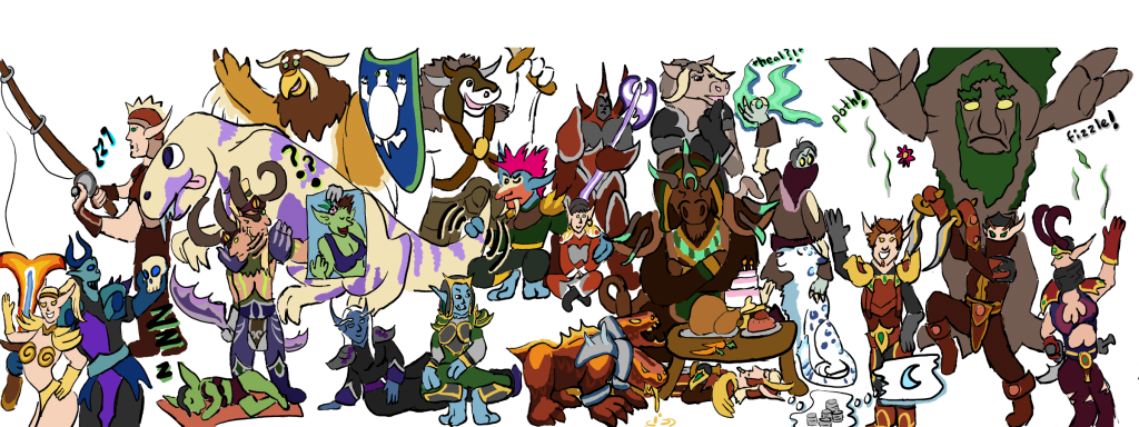
I saved some of my early sketches for A Fond Farewell and decided to post them up for your viewing pleasure!
The first one is a combination of two basic sketches. I started penciling in character positions and some of the expressions I wanted to use in the final image in black ink. In a second pass, I went over some of these with red ink to help clarify lines as well as add in any characters I had missed.
As you can see, almost everyone’s pose was in my head long before any final inking or coloring began. This is not to overblow my visualization prowess though! Getting everyone into positions I was happy with took me nearly the same time that it takes to sketch, finalize, color, and clean up one of my regular comics, and that was just the first part of the process for this picture!

While most of these poses I came up with myself, based on what I know of the players’ personality and past antics, Razorfist and Sortiara’s reference pictures inspired their poses specfically. (You can find those reference pictures here and here.) I don’t know if they had hatched this plan together, wherein Sortiara would appear with a bathing suit and Razorfist was standing next to a poster of a nearly naked goblin that looked just like Sortiara, but, well, I decided to honor it in “A Fond Farewell” !
The next step involved finalizing the lines of these characters, as well as putting in the detail behind individual outfits. Coming up is a series of images showing this process; the captions specify what is new from image to image.


It is interesting to me to look back at some of these early plans and see things I had changed (or in GaGa’s case, that I had forgotten entirely). Tyrdan changed locations several times throughout the drawing process, as I attemped getting his long, prone body into a position in which you could see him clearly but would also not look out of proportion with everyone else. Krampus changed his pose to be holding a skull instead of a sword in his dominant hand, and Arrowkeys lost her bow. (A minor oversight, as in the final image, her hand looks a bit strange not clutching anything!) The biggest oversight I found between the preliminary sketch and the final lines was the lack of GaGa, and it is a large enough one I feel motivated to go back and correct at a later date. For now, you can see her next to Crom in the early sketch, taking up the position that the tauren moonkin representing Blakkthorne or Sunflower occupies in the final image.
The next part of the process was the coloring. For my first pass, I approximated the colors from the character reference screenshots that had been provided to me by my guildies. At this point, I also cleaned up some detail in individual characters’ outfits, such as refining Allardel’s pauldrons and giving Arrowkeys bracers, all based again on the screenshots.

A lot of the time I spent on this was from getting the details of the characters right! As I draw characters based first on how a character fits into a comic, then tweak it based on past comic appearances, then reference in-game screenshots, you will notice plenty of changes in Gentleman Assassin characters throughout my work. In “A Fond Farewell” I tried my hardest to remain faithful to my guild members’ chosen appearances, as this was just as much a commission for all of them as it was a surprise for Ian.
A few of the changes that stick out most in my mind are these: Crom, as usual, changed his in-game outfit yet again, and as that I had no good view of his latest shield, he instead got to bear the guild’s coat-of-arms here. Sortiara specifically asked to be shown in a bathing suit here, though the character normally wears a robe. In his reference screenshot, Razorfist had the Eye of N’Zoth on his forehead, while he normally runs around with an eye-patch on in-game. Not knowing which he preferred and a bit crunched for time, I put both in here.
Some things didn’t change though, to help maintain some consistency with the comics as well to make it easier on my drawing hands. Allardel’s gloves, for instance, are a flat gray, even though his in-game outfit has gloves similar to Tyrdan’s. (Tyrdan and Allardel actually share a lot of the same armor, so Allardel’s appearance here was modified to keep consistency with older comics, while Tyrdan got the more faithful rendition of his in-game looks, seeing as he’s a new character and a horribly arrogant one. Lucky you, Tyrdan.) Ozzel is another character who appears frequently in the comics, so his outfit matches those appearances more closely than his in-game out-fit; the biggest difference is the (lack of) sleeves. Lucy also still has no devilsaur spikes, partly so she doesn’t go poking Crom’s eyes out here.
And some details, well…they have changed multiple times. Minus the gloves, Allardel’s outfit got some touch-ups, in comparison to how it has appeared in other comics featuring him. (No capes!) Although Jacob’s first comic gave him a jaunty feathered hat so one could see his smirk, he has now reverted to the mask and admiral’s cap that he wears both in this image as well as in-game and in later comics. I also finally found a color scheme that I believe fits for Casals: his in-game outfit is horribly complicated, and I haven’t been entirely happy with its knit-sweater-like appearance in his first comic.
After doing a run-through of basic coloring, I went and adjusted some of the colors to help the characters pop out better. Though not an exhaustive list, some of the changes are as follows: Crom’s armor was given a yellower tint to help stand out next to Yotingo. Lucy’s nails were removed to read easier next to Razorfist and Alunetien. Gobdruid got a new fur color. The feast saw some different shades of brown applied to the table and the roast bird. Jacob’s armor color was made more uniform, and RAV saw color changes to her spots. Beyond that, most characters also saw touch-ups applied to their shading, either to help resolve the confusion of their outfit, or to help them stand out while next to characters of similar coloring.

Unfortunately, from this stage onward, I hadn’t remembered to save work-in-progress images, so while writing up this post, I went back to my final image and simply added or removed layers so you can you get the general gist of what I was doing. Keep in mind some of the changes you see were not made in this order, though!
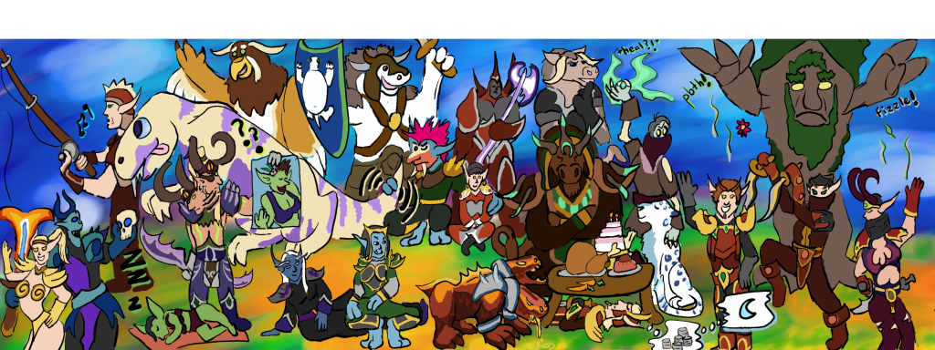
In the next step, I painted in the background on a bottom layer. Though in some of my comics, like the Trials, the background painting is done on several layers, in this one, it was done on only two: one with the main watercolor brush, and one being a mostly-invisible layer above that to add white behind things like character eyeballs or stylistic gaps in my coloring job. The following image has this white layer missing, so you can marvel at the magic that is transparent layers and casual coloring jobs…

Out of a twist of fate, this wasn’t the only version of different backgrounds that I had on file. I had sent a couple work-in-progress pictures to my Alliance-side guild to get their judgement on just how bright and colorful to make it. Some weeks earlier, it had been suggested to me by a user on DeviantArt that I should make my backgrounds of a different color value to help my foregrounds stand out more. The bright and cheerful background in the final image is a version several more stages along in the process. The image below is a more faithful rendition of the earliest attempt to make a darker or less colorful background.

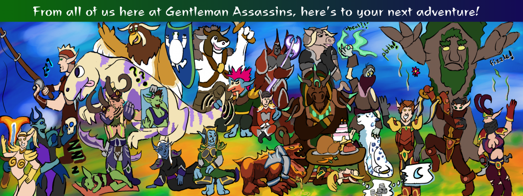
Finally, next came the placement of the text for my message to Ian. As you can see in the image above, I had originally attempted to save a space above Ozzel’s head that would contain the message. I wasn’t happy with how squished-in it looked though, and eventually heightened the picture to make room for a text banner above it, which I also typed in instead of writing out by hand. Much better!

And there you have it! How I created “A Fond Farewell”, step by step…or more or less. Overall this took me about two days, or five times longer than making one of the smaller comics. I believe it was well worth it, though! A lot of work went into this one, and overall I believe it was a success. Guild’s day made, and guild leader’s day made especially!
